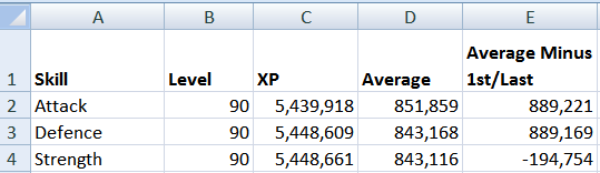
We ended up with a worksheet that looked like this:

Time to open up your workbook for round two! Today we will be making the same averages table that habitually turns up in screenshots in my Runescape blog.
Runescape Excel Hiscores Tracker: Formatting your Data
While we now have some data, it's going to look messy, unless we format it first. Fortunately, that's really easy to do and takes whole seconds.
- Left-click on the F, so that the whole column is highlighted.
- Still holding your left-click down, drag your mouse onto the G. You should have both the F and G columns highlighted now.
- Right-click anywhere in those columns.
- Select Format Cells from the menu.
- Select Number from the category list.
- Ensure that 'Decimal Places' is set to O and tick the box to use the 1000 separator.
- Press OK and happy dance. Your columns are now ready to receive some data.
- In F1, copy and paste this formula: =SUM(D1+0)
- Select F1, so that the cell is highlighted.
- Click the tiny square in the right-hand, bottom corner.
- Drag it down to F26.
- In G1, copy and paste this formula: =SUM(E1+0)
- Repeat the steps above to fill in your column down to G26.
- Save your workbook.
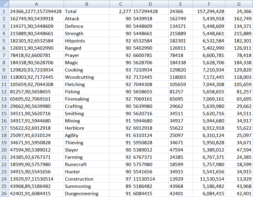
Chart Time! Hiscores and Averages in Excel
After all this boring data stuff, it's about time you had a chart to show for your trouble. Right now, we have the data to simply display your hiscores and to create a table to calculate your averages.
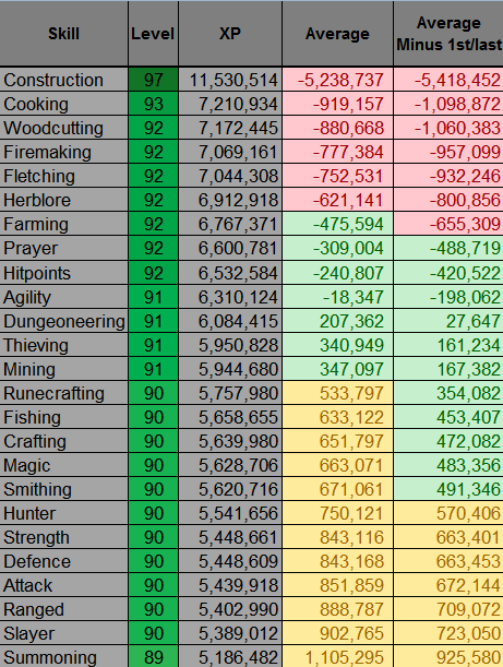
I'm a player who likes to keep my levels fairly even, so this is a chart that I use a lot. It tells me what needs pushing upwards to get it into the middle. My ideal is to have everything within just a few xp of each other. For those of you less picky, just call it a curiosity.
We're aiming for something that looks like this:
Before heading into this, make a note of what you called the worksheet (or tab) with all of your data on it. I called mine 'Data'. You're going to need to know that for the formulas on the next page.
- Click the tab entitled 'Sheet2' to open a fresh new worksheet.
- Right-click the tab to rename it. I've called mine 'Runescape Hiscores'.
- Click cell A1. Type in a heading like 'Skill'.
- Click cell A2. Copy and paste this formula: =Data!B2 (NB Data is the name of my worksheet with the data on it. If you chose a different name, then substitute 'data' for your worksheet's name.)
- Drag the formula down to cell A26.
- Do the 'cheer' emote, as all of the skills are listed from Attack to Dungeoneering.
- Click cell B1. Type in a heading like 'Level'.
- Click cell B2. Copy and paste this formula: =Data!C2
- Drag the formula down to cell B26.
- Woot if all of your levels are listed next to the appropriate title.
A note about what you did there, just in case you want to experiment on your own. You've basically typed an address into each cell. =Worksheetname!Cell reference within that worksheet. So =Data!A1 would capture whatever is showing in cell A1, in the Data worksheet. Savvy?
- Click cell C1. Type in a heading like 'XP'.
- Click cell C2. Copy and paste this formula: =Data!F2
- Drag the formula down to cell C26.
- Click cell D27. Copy and paste this formula: =AVERAGE(C2:C26)
- Click cell D28. Copy and paste this formula: =AVERAGE(C3:C25)
- Press return.
- Feel accomplished.
- Click cell D1. Type in a heading like 'Average'.
- Copy the following and paste it into cell D2.
=D27-C2
=D27-C3
=D27-C4
=D27-C5
=D27-C6
=D27-C7
=D27-C8
=D27-C9
=D27-C10
=D27-C11
=D27-C12
=D27-C13
=D27-C14
=D27-C15
=D27-C16
=D27-C17
=D27-C18
=D27-C19
=D27-C20
=D27-C21
=D27-C22
=D27-C23
=D27-C24
=D27-C25
=D27-C26
- Click cell E1. Type in a heading like 'Average Minus 1st/Last'.
- Copy the following and paste it into cell E2.
=D28-C2
=D28-C3
=D28-C4
=D28-C5
=D28-C6
=D28-C7
=D28-C8
=D28-C9
=D28-C10
=D28-C11
=D28-C12
=D28-C13
=D28-C14
=D28-C15
=D28-C16
=D28-C17
=D28-C18
=D28-C19
=D28-C20
=D28-C21
=D28-C22
=D28-C23
=D28-C24
=D28-C25
=D28-C26
- Save the workbook.
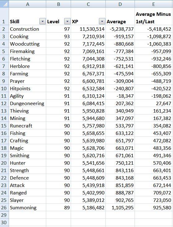
Happy days? You should have something that looks like this:
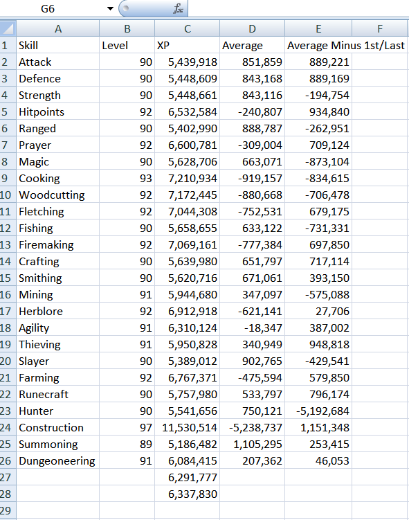
That is basically the same averages chart that I pictured above, but without the pretty colours.
Pimp Your Runescape Hiscores Averages Table
Excel has an array of colours, fonts, clip art and stuff to spice up your charts. I recommend going all hands on imperative with this one, as you're the person who's going to be staring at it from now on. Click buttons and see what you have to create much prettiness. It's all good fun.
Just remember to save after you do stuff. I know from bitter experience how horrible it is to lose hours of work, because you messed up on something experimental.
For those who want a carbon copy of mine, then I'll talk you through it.
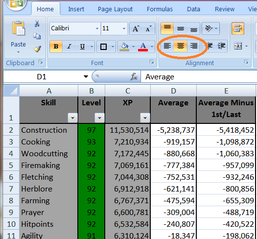
- Click on the 1, so that the top row is highlighted.
- Select 'B' (bold) from the (Home) format tab above.
- Right-click anywhere on that row.
- Select 'format cells' from the menu.
- Click on the Alignment tab.
- Tick 'wrap text' from the Text Control section.
- Click ok.
- Move your mouse to the bar between the E and F. It will change shape into a kind of cross thingie with arrows.
- Left-click to drag the column, so that it's wider. Then you can fight 'minus 1st/last' on the same line.
- If necessary, use the same tactic between the 1 and 2 to make the row smaller.
- Click on the 27 and drag your mouse to the 28. You should have both rows highlighted.
- Right-click anywhere in that row.
- Select 'hide' from the menu.
- Click on the A, then drag so that A, B and C columns are highlighted.
- Click the 'Sort and Filter' tab, which is located on the right-hand side of the 'Home' tab toolbar.
- Click 'Filter'.
Warning: Don't try to sort the Average columns. It'll mess up the formulas there and you'll have to return to this guide to paste them all in again. :p
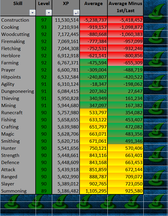
My table now looks like this:
Adding a Splash of Colour to your Runescape Hiscores Averages Table
All of the information is there, but it looks a bit boring. In order to jazz it up, I'm going to use a couple of the functions in the 'Home' tab toolbar.
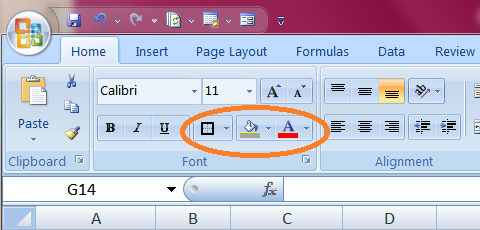
- Highlight the entire table. You can do this by clicking on one corner then, with your left-click held down, dragging your mouse diagonally across to the opposite corner.
- Click the border button, in the 'font' category, on the 'Home' toolbar.
- From the pull down menu, select a border. I've gone for 'Thick Box Border'.
- Highlight the five cells that make up your header.
- Select a border for it, as you did for the whole table. I'm still with 'Thick Box Border'.
- Highlight the same five cells again.
- Click on the paint bucket icon, in the 'font' category, on the toolbar just above.
- Choose your colour. I've gone for dark grey.
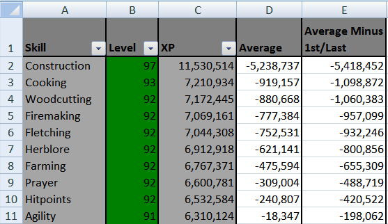
- Highlight the cells with the skills listed.
- Click on the paint bucket icon and choose your colour. I've gone for light grey.
- Select a border for it, as you did with the header. I'm with 'Thick Box Border' all the way.
- Repeat this for the columns displaying the Levels and XP as well. I've chosen green for the levels and the same light grey as above for the XP.
Tidying Up the Header in your Hiscores Averages Table
This looks reasonably brighter, but the header is annoying me. I'm going to reposition the text a bit, so that I can make the columns a bit narrower.
- Highlight the five header cells.
- Right-click anywhere in the highlighted cells and select 'format cells'.
- Select the 'Alignment' tab.
- Select 'Center' from the pull-down menu under Horizontal.
- Select 'Top' from the pull-down menu under Vertical.
- Press OK.
- Make your columns narrower or wider by moving your cursor to the 'wall' between two letters.
- Left-click and drag in the direction that you want.
- Click on the B to highlight the 'Level' column.
- Press the 'center' button on the 'Alignment' category of the 'Home' tab toolbar.
- Applaud at how much neater it all is.
Traffic Light Effect in Colouring the Averages Columns
Of course, what everyone comments upon is the triple colour effect that I have decorating my averages columns. It's almost short-hand amongst my friends to ask me what's 'in the green' these days.
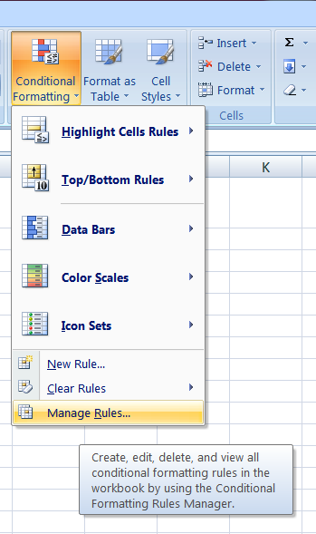
This is added using the Conditional Formatting function, which can be found in the 'Home' tab toolbar.
- Highlight the cells D2 to E26.
- Click the Conditional Formatting button and choose 'Manage Rules'.
- Select 'Format only cells that contain'.
- In the preview, select the format button.
- Choose a colour for the lower end of your levels. I've clicked on 'fill effects', then chosen two shades of yellow for a gradient two colour effect.
- Press ok, until you are back at the 'New Formatting Rule' box.
- Select 'cell value', 'between', '200000000' and '499999', in the pull down menus of the 'Edit Rule Description' section.
Obviously it's up to you what numbers you want to put in there. I'm aiming for the meridian point having a scope of 500,000 xp each way. So my skills only turn green if they're within that 1m range of the middle point. You may want less or more. The 200,000,000 is just a random number to mean infinity. The 499,999 is as far short of the meridan as I want to go.
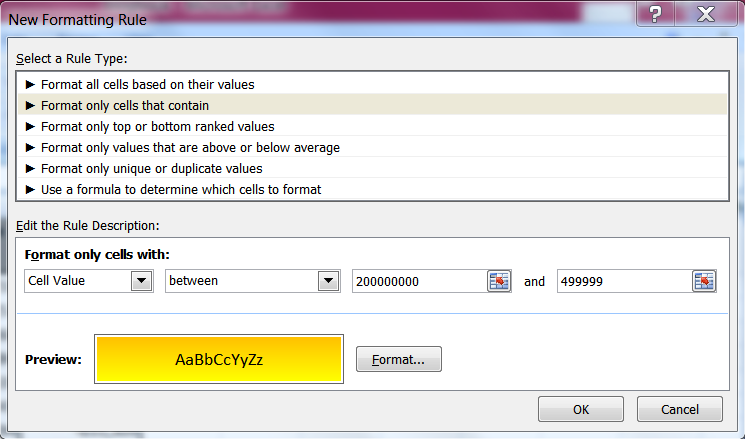
- Press OK.
- Press 'new rule'.
- Repeat the above process, with different colours (I've gone for two shades of green), adding in the numbers 500000 and -499999.
- Repeat again with the numbers -500000 and -200000000. (I've gone for two shades of red.)
- Press apply.
If you really want it to stand out, you could add a background to the rest of the worksheet. There are two ways of doing this.
- Select the Page Layout tab, from the top toolbar.
- Click on 'Background' in the 'Page Setup' category.
- Choose a picture from your hard-drive to insert there.
- Highlight all of the columns and rows around your table.
- Click on the paint bucket icon, in the 'Home' tab.
- Fill it with the colour of your choice.
Most of the hard work is done now, in terms of adding data. It's mostly making things from it. Next time, we'll be adding just a bit more data and then we'll look at a chart that calculates how much XP to your next level. Hurrah!
Thanks for the valuable information and insights you have so provided here...
ReplyDeleteosrs max main